# A Lightbox That Ships No Stylesheet

> Most UI packages arrive with their own stylesheet, their own theme, and their own opinions about your design system. This module argues that a small component should inherit the host's styling instead of bringing its own, and shows the approach in React Lightbox, our open source lightbox built from hooks, inline SVG icons, and Tailwind class strings.

- Series: Knowledge Module (SKM-005)
- Published: 2026-08-28
- Updated: 2026-08-28 (v0.1.0)
- Author: Summit ML
- Tags: developer-experience, open-source, frontend
- Canonical: https://summitml.com/knowledge/a-lightbox-that-ships-no-stylesheet

**A lightbox is a dark overlay, one piece of content, two arrows, and a close button. It should not need its own stylesheet, its own theme, or an afternoon of overrides.**

> **Audience:** Frontend Engineers · Design Engineers · Tech Leads

> The best small component looks like you wrote it, because its styles are yours.

## Executive summary

Every gallery needs a lightbox, and most lightbox packages come with more than the lightbox. There is a CSS file to import, a theme object to configure, a set of class names to override, and a dark mode that does not match yours. The component works on the first day and costs you on every day after, each time the design changes.

We wanted the opposite: a lightbox with nothing to ship and nothing to fight. React Lightbox is hooks, inline SVG icons, and Tailwind class strings. It has no stylesheet. It inherits your Tailwind theme, and every part of it can be restyled with a `className` prop. We released it under the MIT license, and it is currently in beta.

This module covers the idea first, then the component, with enough examples to drop it into a project.

## The cost of a component that brings its own styles

A packaged stylesheet makes three promises it cannot keep.

**It promises to look right.** It looks right in the package's demo. In your app it has the wrong radius, the wrong overlay color, and buttons that match nothing else on the page.

**It promises to be overridable.** Overriding means out-ranking the package's selectors, which usually ends in longer selectors or `!important`.

> **Avoid:** `.gallery .third-party-lightbox__close { background: transparent !important; }`

> **Prefer:** `closeButtonClassName="bg-transparent"`

**It promises to stay out of the way.** A stylesheet is global. It ships to every page, whether or not the lightbox is ever opened, and it is one more thing to check when something on the page looks off.

When the component is built from the same utility classes as the rest of your app, none of this applies. There is nothing to import, nothing to out-rank, and the theme is already yours.

## What "just hooks and Tailwind" means

| Part | How it is built | What you maintain |
| --- | --- | --- |
| State and behavior | React hooks | Nothing |
| Icons | Inline SVG | Nothing, and no icon package |
| Styling | Tailwind class strings | Nothing, they compile with your own CSS |
| Overrides | `className` props, merged for you | Only the classes you want to change |

The component's default classes go through the same Tailwind build as your own. Your colors, your breakpoints, and your dark mode apply to it without configuration.

![One lightbox component in three differently themed apps: dark, light, and branded](/images/knowledge/lightbox-themes.svg)

## Using React Lightbox

### Install

```bash
npm i @summitml/react-lightbox
```

Your app needs React 18 or later and Tailwind 3 or later.

### Tell Tailwind where the classes are

Tailwind only generates the classes it can see. Add one line to the `content` list in `tailwind.config.js` so it scans the package:

```js
/** @type {import('tailwindcss').Config} */
module.exports = {
  content: [
    './src/**/*.{js,jsx,ts,tsx}',
    './node_modules/@summitml/react-lightbox/**/*.{js,jsx}',
  ],
  theme: { extend: {} },
  plugins: [],
};
```

Restart your dev server after the change. If the lightbox opens with no dark background and no layout, this line is what is missing.

### The smallest example

One piece of state, one `isOpen` prop, and any children you like.

```jsx
import { useState } from 'react';
import { Lightbox } from '@summitml/react-lightbox';

export default function Gallery() {
  const [open, setOpen] = useState(false);

  return (
    <>
      <button onClick={() => setOpen(true)}>Open lightbox</button>

       setOpen(false)}>
        <img src="/photos/one.jpg" alt="Ridge at sunrise" />
        <img src="/photos/two.jpg" alt="Trail through pines" />
        <img src="/photos/three.jpg" alt="Lake below the summit" />
      
    </>
  );
}
```

### Open at the image that was clicked

The usual gallery: a grid of thumbnails, and the lightbox opens on the one the visitor chose. `defaultIndex` sets the starting child each time the lightbox opens.

```jsx
import { useState } from 'react';
import { Lightbox } from '@summitml/react-lightbox';

const photos = [
  { src: '/photos/one.jpg', alt: 'Ridge at sunrise' },
  { src: '/photos/two.jpg', alt: 'Trail through pines' },
  { src: '/photos/three.jpg', alt: 'Lake below the summit' },
];

export default function Gallery() {
  const [index, setIndex] = useState(null);

  return (
    <>
      <div className="grid grid-cols-3 gap-3">
        {photos.map((photo, i) => (
          <button key={photo.src} onClick={() => setIndex(i)}>
            <img src={photo.src} alt={photo.alt} className="rounded-md" />
          </button>
        ))}
      </div>

       setIndex(null)}>
        {photos.map((photo) => (
          <img key={photo.src} src={photo.src} alt={photo.alt} />
        ))}
      
    </>
  );
}
```

### Anything can be a slide

The lightbox does not care what its children are. Images and video work directly:

```jsx
 setOpen(false)}>
  <img src="/photos/one.jpg" alt="Ridge at sunrise" />
  <video src="/clips/summit.mp4" controls />

```

For your own components, wrap them in `RefWrapper`. The lightbox needs a reference to the current slide so it can tell a click on the slide from a click on the background, and `RefWrapper` supplies one:

```jsx
import { Lightbox, RefWrapper } from '@summitml/react-lightbox';

 setOpen(false)}>
  <img src="/photos/one.jpg" alt="Ridge at sunrise" />


```

One thing to know: the lightbox sizes each direct child to fit the screen by setting its `className`. Put your own classes on elements inside the child, not on the child itself.

### Restyle any part

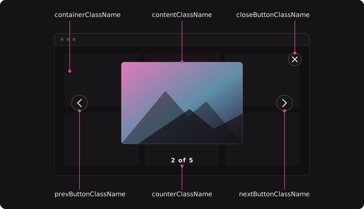
Each part of the lightbox takes a `className` prop. Your classes are merged with the defaults, and where the two conflict, yours win.
![The parts of the lightbox, each labeled with the className prop that styles it](/images/knowledge/lightbox-anatomy.svg)

```jsx
 setOpen(false)}
  containerClassName="bg-slate-950/95 z-[100]"
  closeButtonClassName="rounded-full bg-white/10 hover:bg-white/20"
  navigationButtonClassName="rounded-full bg-white/10"
  counterClassName="font-mono text-xs tracking-widest"
>
  <img src="/photos/one.jpg" alt="Ridge at sunrise" />
  <img src="/photos/two.jpg" alt="Trail through pines" />

```

What that merge does, for one prop:

| | Classes |
| --- | --- |
| Default | `fixed inset-0 bg-black bg-opacity-80 flex items-center justify-center z-50` |
| You pass | `bg-slate-950/95 z-[100]` |
| Result | The default layout, with your background and your z-index |

The full list of parts:

| Prop | Styles |
| --- | --- |
| `containerClassName` | The full-screen overlay |
| `closeButtonClassName` | The close button |
| `contentWrapperClassName` | The wrapper around the slide and arrows |
| `contentClassName` | The area the slide sits in |
| `navigationButtonClassName` | Both arrows |
| `prevButtonClassName` | The previous arrow only |
| `nextButtonClassName` | The next arrow only |
| `counterClassName` | The "2 of 5" counter |

### What visitors can do

| Action | Mouse | Keyboard | Touch |
| --- | --- | --- | --- |
| Next slide | Click the right arrow | Right arrow key | Swipe left |
| Previous slide | Click the left arrow | Left arrow key | Swipe right |
| Close | Click the close button or the background | Esc | Swipe down |

Navigation wraps: next on the last slide goes to the first. A counter at the bottom shows the position, such as "2 of 5".

## What it does not do

React Lightbox is deliberately small, and it is in beta at version 0.0.4.

- **It requires Tailwind.** Without Tailwind in the project there are no styles at all. That is the design, and it is also the limit.
- **No zoom, thumbnails, or captions.** If you need a caption, make it part of the slide you pass in.
- **No animation between slides.** The content swaps.
- **It does not lock page scroll or trap focus.** If your page needs either while the lightbox is open, add it around the component.

If your project needs the features in that list out of the box, a larger library is the better fit. If you need a lightbox that looks like the rest of your app on the first render, this is the one we use.

## Applying the idea beyond lightboxes

The same test works for any small UI dependency you are about to add:

| Question | A good answer |
| --- | --- |
| Does it ship a stylesheet? | No, or one you can leave out |
| How do I change how it looks? | With the same tools I style everything else with |
| Does it follow my dark mode? | Yes, without configuration |
| What does it add to every page? | Nothing until it is used |

A component that passes inherits your design system. One that fails becomes a second design system you maintain by overriding it.

## Key takeaways

- A packaged stylesheet looks right in the demo and wrong in your app, and overriding it is a permanent cost.
- A component built from hooks and utility classes has nothing to import and nothing to out-rank.
- React Lightbox opens with one `isOpen` prop, takes any children, and handles the overlay, arrows, counter, keyboard, and swipe.
- Every part can be restyled with a `className` prop, and your classes win over the defaults.
- It is small on purpose. Know what it leaves out before you pick it.

## Links

- [React Lightbox on GitHub](https://github.com/summit-ml/react-lightbox)
- [React Lightbox on npm](https://www.npmjs.com/package/@summitml/react-lightbox)
- [Summit ML open source projects](https://summitml.com/products/open-source#react-lightbox)

## Changelog

- 0.1.0 (2026-08-28) — First draft.
