Case StudiesImage AuthorityWeb Design & Development
A Website Built to Earn the Conversation
How we took Image Authority from an informational brochure to an enterprise business-development site: a living design system, a 35-page prototype, and client review in the browser.
- Client
- Image Authority, a Workwear Outfitters brand
- Scope
- Strategy, design system, full-site prototype, developer handoff
- Handoff
- Figma files, component page, change markers
- Timeline
- August to October 2026
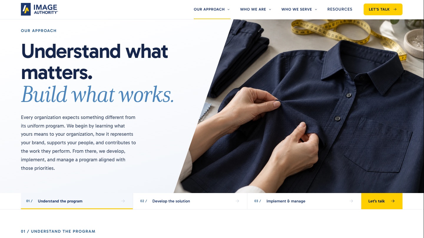
01Challenge
A Name Prospects Don't Know Yet
Image Authority manages some of the largest and most complex uniform programs in the United States, with relationships that have lasted decades at organizations like FDNY, FedEx, DHS, AT&T, and the National Park Service. Most prospects still don't know the name. The site had to establish credibility quickly, show that the company understands programs like theirs, and give them a reason to talk.
The existing imageauthority.com was a short brochure. The brief we wrote at the start set the goal plainly: evolve the website from a primarily informational experience into an enterprise business-development platform for the decision-makers who evaluate uniform-program partners.
- A homepage made of a hero, one paragraph, and three cards, with no proof points and no path to a conversation
- The company's differentiators locked in a static diagram and long text blocks
- Nine industries as tiles that each swapped a paragraph in place, with no sense of breadth
- A contact form with a stock “What can we help you with today?” dropdown
- Inconsistent heading sizes, type scale, and interaction states
Two constraints shaped everything
This was not a brand exercise. Workwear Outfitters Creative Services owns the Image Authority brand and was updating the guidelines at the same time, so our job was to translate an evolving brand into a digital system, not redefine it. And a separate agency would build the production site, so the deliverable had to be a reviewable, documented, componentized design that another team could implement.
02Approach
Design System Before Design
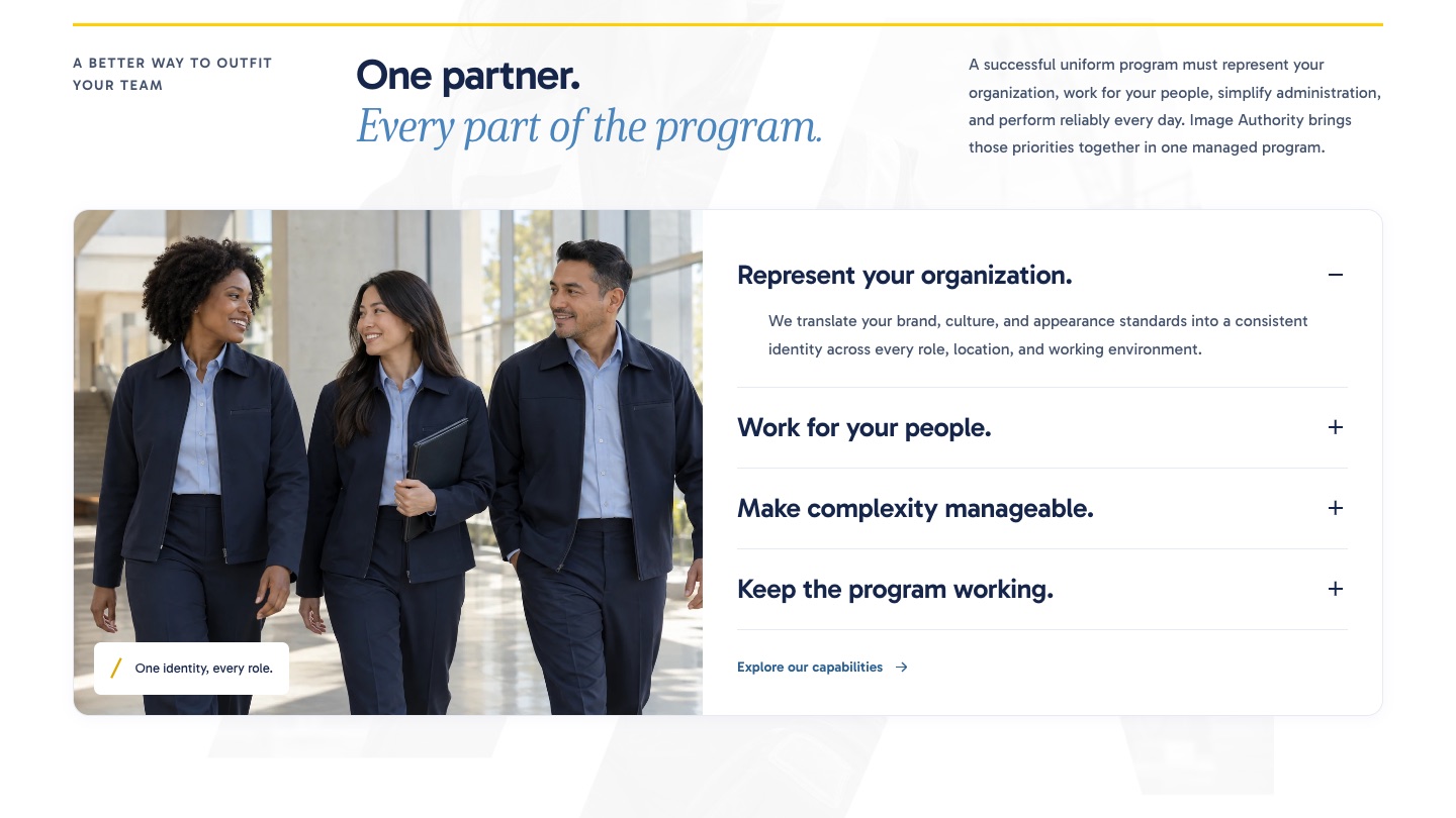
Rather than a single homepage mockup, we built the brand as a living HTML design system that went through seven versions in four weeks. Each version carried tokens, components, type samples, and photography, so the homepage could be assembled from the system rather than drawn by hand.
Hero options went through two passes before the client chose a direction. A copy-review document listed every word on the homepage in page order so the client could edit prose without touching design. Typography moved to Gabarito with highlighted words in an italic serif, which became the signature of the system.
03Prototype
From One Homepage to a Whole Site
The approved homepage and the client's navigation outline were expanded into a complete 35-page site, generated from structured content so that coordinated changes across every page were a single edit. A verifier checked every internal link, fragment, asset reference, page title, and image attribute on each build.
Two days after the full concept existed it was deployed for client review at a stable URL, and the rest of that day was spent iterating live in the browser: header weight, dropdown anchoring, hero proportions, hover states, and a content pass against the client's messaging platform.
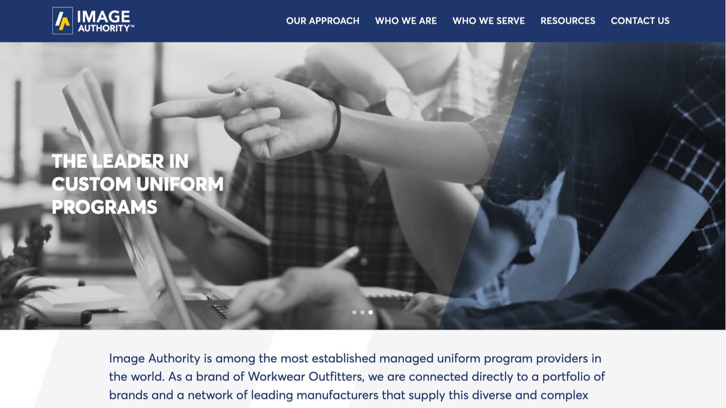
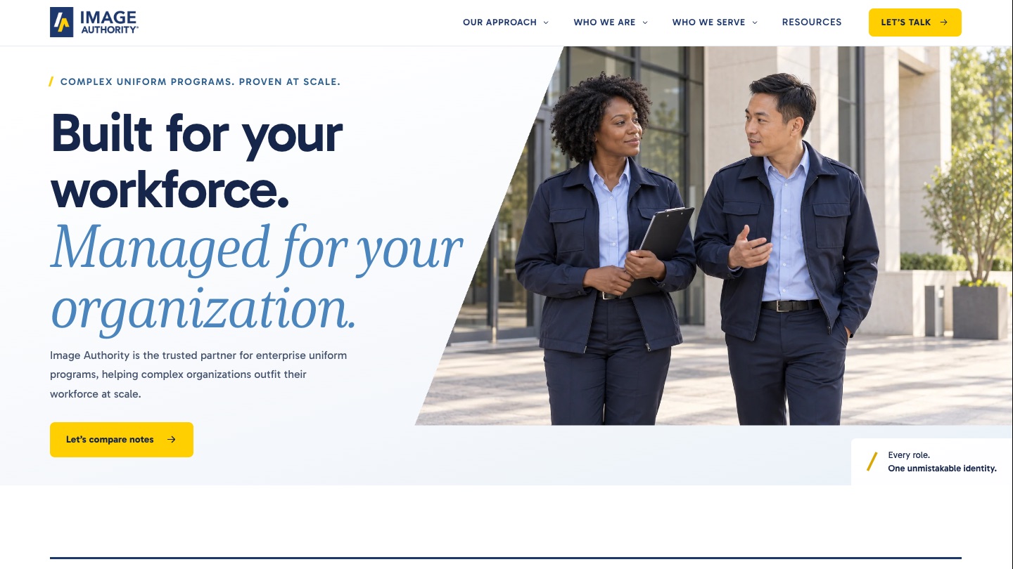
The old homepage was a hero, one paragraph, and three cards. The new one leads with a single call to action and proof.
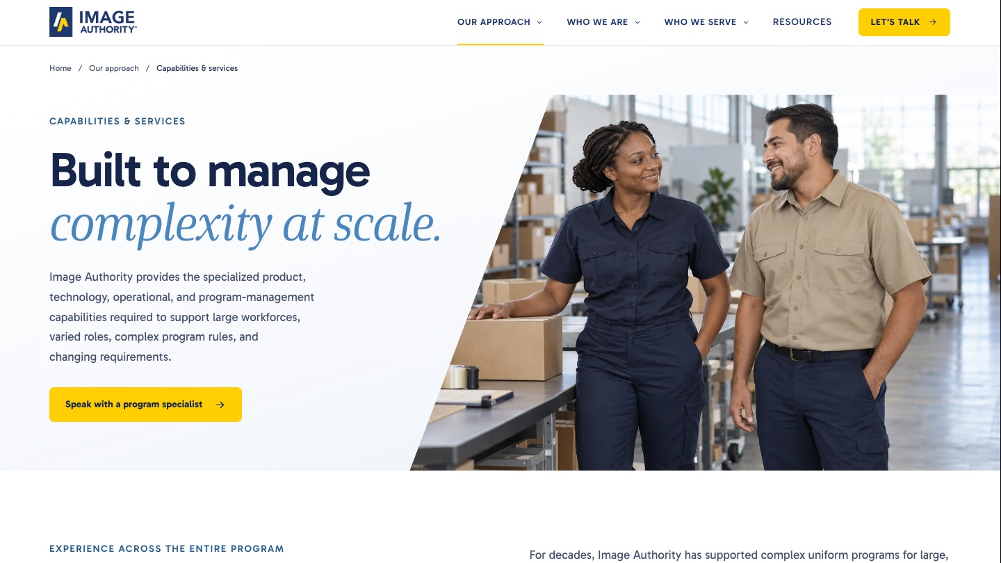
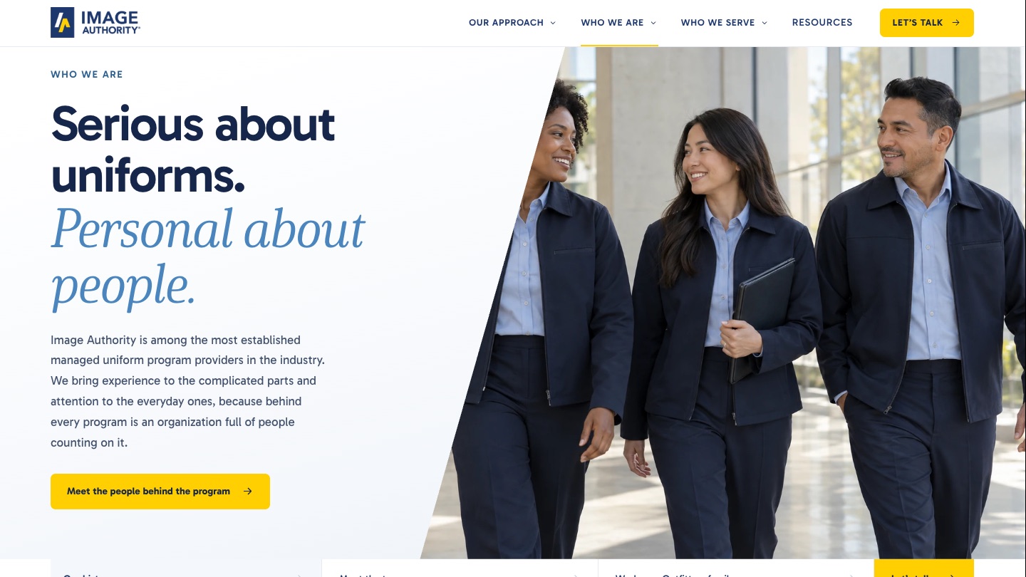
- Approach overview, capabilities, company history, team, and a Workwear Outfitters family section
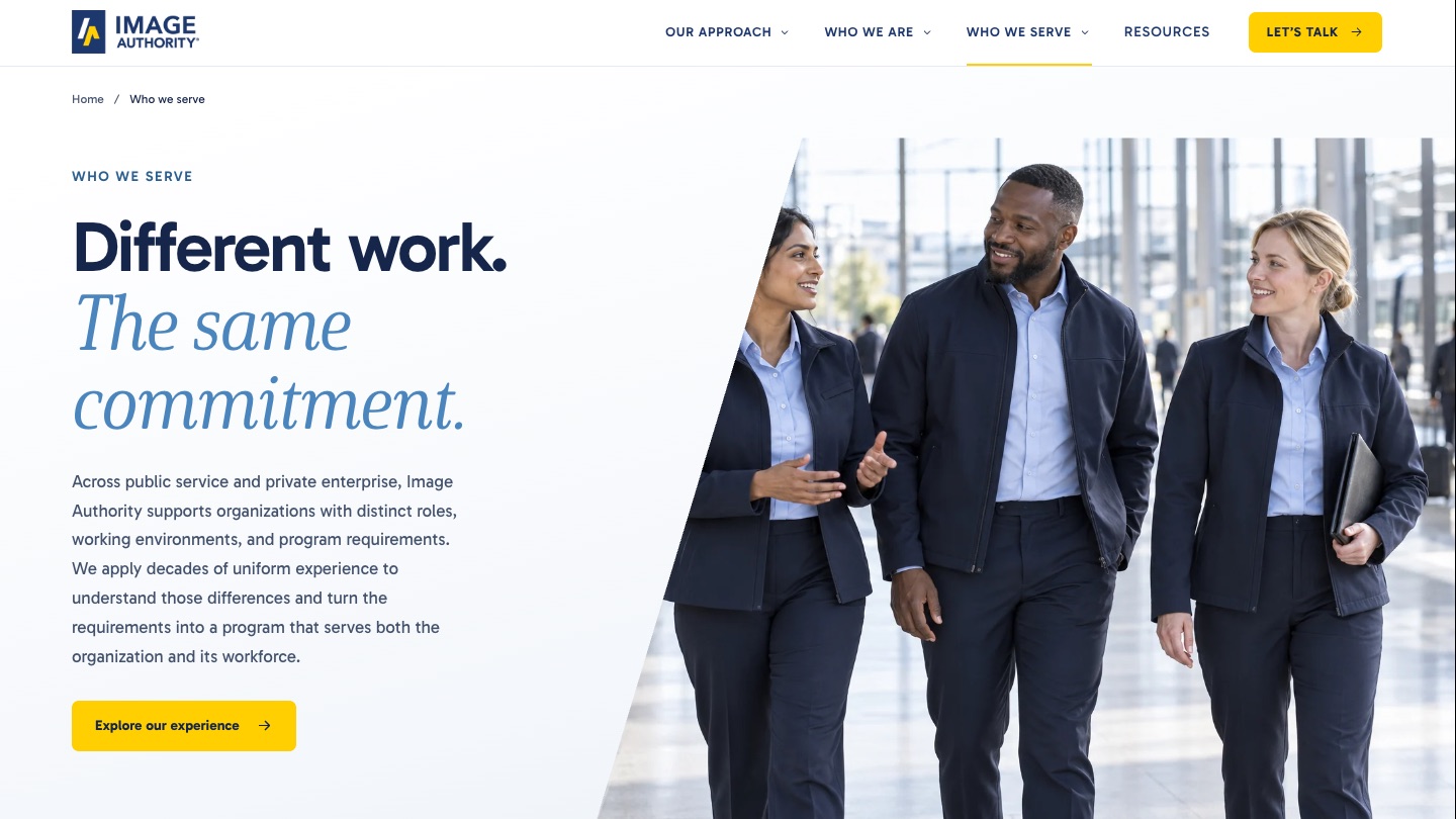
- An industry index with dedicated pages and three illustrative program scenarios
- A resource hub with a gated-download pattern and sample planning tools
- Existing content preserved: team biographies, history, contact details, PDFs, and video
04Review
Review on the Live Site
The client team is not a web team, so feedback was collected with CommentLayer, pinned to the live responsive pages instead of written up in PDFs or marked-up screenshots. Each note landed on the exact element it was about, which kept the conversation on the work rather than on describing where the work was.
Those notes became the project's change log and the record of what the client actually asked for, and each batch was applied and redeployed within a day.
- Numbers stripped from tiles, tabs, and sections, kept only for process steps and the timeline
- A headline underline that read like a competitor removed; the serif emphasis kept
- Photo heroes on every page, more of the brand's medium blue, and a rotating stat bar
- The brand's own serif loaded from the client's font kit, and logo-mask CTA bands
- Industry copy reworked so the list reads as a sample of experience, not a limit
Love this layout! I'll start refining copy and give directions for images.
05The turn
Earning the Conversation, Not Replacing It
Late in the project the feedback changed character. The first prototype was content-rich and invited exploration. The client's sales lead argued it was asking prospects to do too much before the site had earned their interest.
The website should not try to replace the sales conversation. It should establish enough credibility, relevance, and confidence to earn that conversation.
The site got simpler and more confident as a result. Copy was rewritten site-wide around three jobs: establish credibility through recognizable organizations and long relationships, demonstrate understanding of identity, employee, and operational requirements, and offer one clear next step.

- A new tagline, “Complex uniform programs. Proven at scale.”
- One call to action everywhere: “Let's compare notes”
- The client logo band moved directly under the hero with “since” captions
- A four-part capabilities wheel with “Your priorities shape the program” at the centre
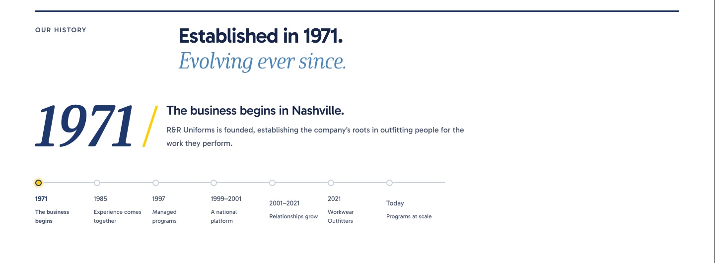
- Ten target industries replacing the nine legacy ones, and a timeline cut from eleven milestones to seven
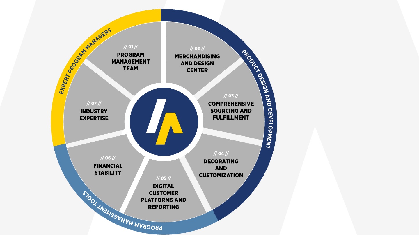
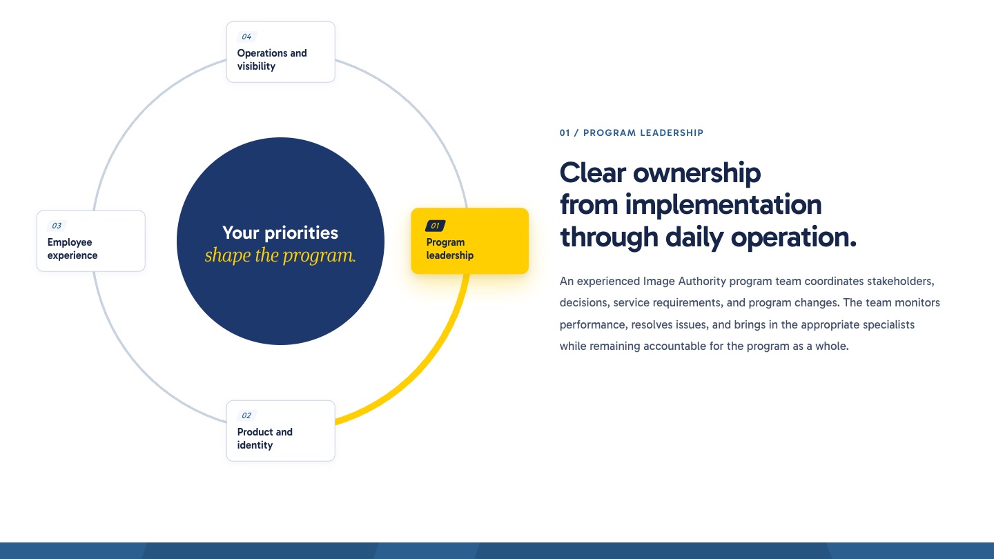
A static seven-segment diagram became an interactive four-part wheel with a detail panel for each part.
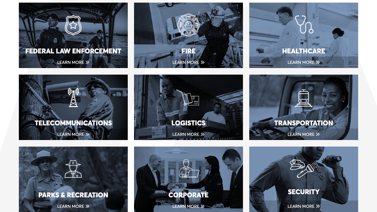
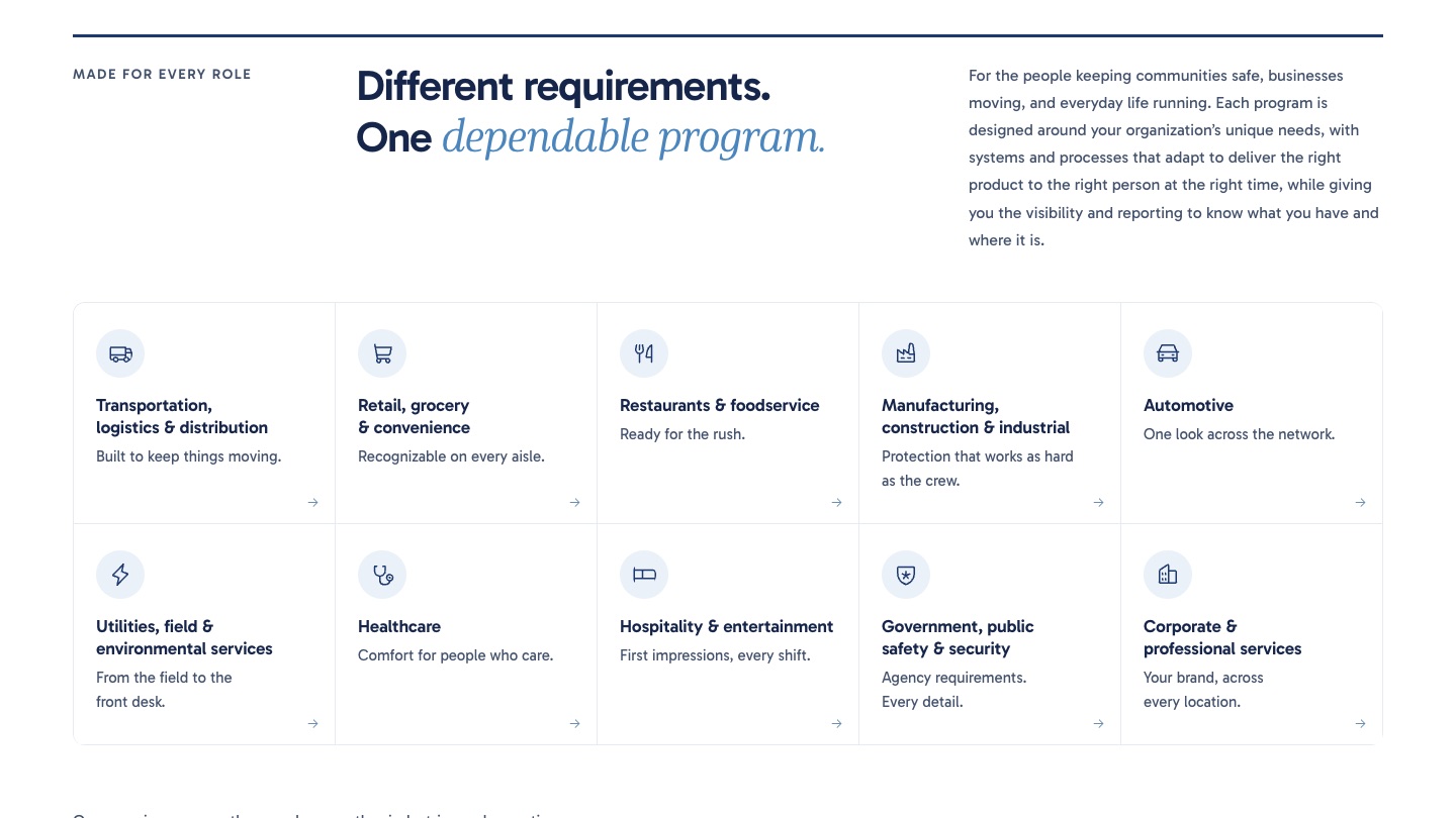
Nine tiles that each swapped a paragraph became ten industries with roles and flyouts.
06Handoff
A Handoff Another Agency Can Read
Because the development partner had already started building from the previous version, the final revisions had to be legible as a diff. Every page was archived as a linked snapshot that browses as a complete site. A build-time annotation put a dashed outline and a “Change from earlier version” pill on each altered element, with the reason on hover, and a corner toggle hides the markers for clean viewing.
For the Figma handoff, a hidden page compiles every shared and one-off component on the site with hover, focus, and active states rendered statically. It is generated from the same templates as the live pages, so it cannot drift.
07Results
By the Numbers
The repository, the component pages, the archive, and the live prototype are the handoff package. The production site is being built by the client's development partner from the prototype and Figma files, targeted for launch before Thanksgiving 2026.
Next up: a capabilities one-pager and a presentation template built from the same design system, so the sales team's collateral matches the site that earns the conversation.
Let's Build
Is Your Website Doing Too Much?
We design sites that establish credibility fast and lead to one clear next step, then hand them off so any team can build them.